Applets available layouts,
- BorderLayout
- BoxLayout
- CardLayout
- FlowLayout
- GridBagLayout
- GridLayout
- GroupLayout
- SpringLayout
This section shows example GUIs that use these layout managers, and tells you where to find the how-to page for each layout manager. You can find links for running the examples in the how-to pages and in the example index.
Note: This lesson covers writing layout code by hand, which can be challenging. If you are not interested in learning all the details of layout management, you might prefer to use the
GroupLayout layout manager combined with a builder tool to lay out your GUI. One such builder tool is the NetBeans IDE. Otherwise, if you want to code by hand and do not want to use GroupLayout, then GridBagLayout is recommended as the next most flexible and powerful layout manager.
If you are interested in using JavaFX to create your GUI, see Working With Layouts in JavaFX.
BorderLayout
Every content pane is initialized to use a
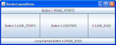
BorderLayout. (As Using Top-Level Containers explains, the content pane is the main container in all frames, applets, and dialogs.) A BorderLayout places components in up to five areas: top, bottom, left, right, and center. All extra space is placed in the center area. Tool bars that are created using JToolBar must be created within a BorderLayout container, if you want to be able to drag and drop the bars away from their starting positions. For further details, see How to Use BorderLayout.BoxLayout
The
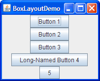
BoxLayout class puts components in a single row or column. It respects the components' requested maximum sizes and also lets you align components. For further details, see How to Use BoxLayout.CardLayout
The
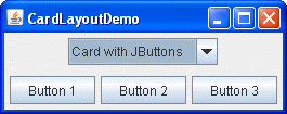
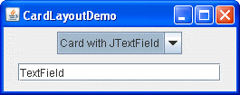
CardLayout class lets you implement an area that contains different components at different times. A CardLayout is often controlled by a combo box, with the state of the combo box determining which panel (group of components) the CardLayout displays. An alternative to using CardLayout is using a tabbed pane, which provides similar functionality but with a pre-defined GUI. For further details, see How to Use CardLayout.FlowLayout
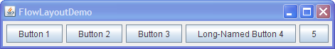
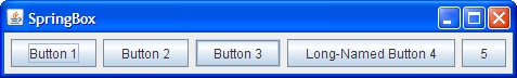
FlowLayout is the default layout manager for every JPanel. It simply lays out components in a single row, starting a new row if its container is not sufficiently wide. Both panels in CardLayoutDemo, shown previously, useFlowLayout. For further details, see How to Use FlowLayout.GridBagLayout
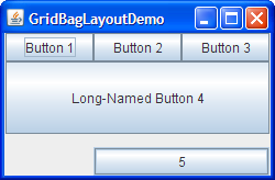
GridBagLayout is a sophisticated, flexible layout manager. It aligns components by placing them within a grid of cells, allowing components to span more than one cell. The rows in the grid can have different heights, and grid columns can have different widths. For further details, see How to Use GridBagLayout.GridLayout
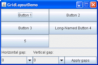
GridLayout simply makes a bunch of components equal in size and displays them in the requested number of rows and columns. For further details, see How to Use GridLayout.GroupLayout
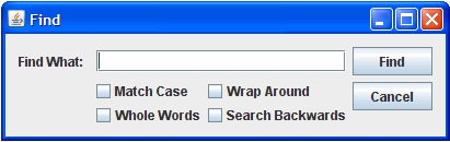
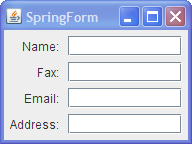
GroupLayout is a layout manager that was developed for use by GUI builder tools, but it can also be used manually. GroupLayout works with the horizontal and vertical layouts separately. The layout is defined for each dimension independently. Consequently, however, each component needs to be defined twice in the layout. The Find window shown above is an example of a GroupLayout. For further details, see How to Use GroupLayout.SpringLayout
Example,
import java.awt.*;
import java.applet.*;
public class LayoutSample extends Applet
{
// A Button to click
Button okButton;
// A textField to get text input
TextField nameField;
// A group of radio buttons
// necessary to only allow one radio button to be selected at the same time.
CheckboxGroup radioGroup;
// The radio buttons to be selected
Checkbox radio1;
Checkbox radio2;
// An independant selection box
Checkbox option;
public void init()
{
// Tell the applet not to use a layout manager.
setLayout(null);
// initialze the button and give it a text.
okButton = new Button("A button");
// text and length of the field
nameField = new TextField("A TextField",100);
// initialize the radio buttons group
radioGroup = new CheckboxGroup();
// first radio button. Gives the label text, tells to which
// group it belongs and sets the default state (unselected)
radio1 = new Checkbox("Radio1", radioGroup,false);
// same but selected
radio2 = new Checkbox("Radio2", radioGroup,true);
// Label and state of the checkbox
option = new Checkbox("Option",false);
// now we will specify the positions of the GUI components.
// this is done by specifying the x and y coordinate and
//the width and height.
okButton.setBounds(20,20,100,30);
nameField.setBounds(20,70,100,40);
radio1.setBounds(20,120,100,30);
radio2.setBounds(140,120,100,30);
option.setBounds(20,170,100,30);
// now that all is set we can add these components to the applet
add(okButton);
add(nameField);
add(radio1);
add(radio2);
add(option);
}
}
No comments:
Post a Comment